

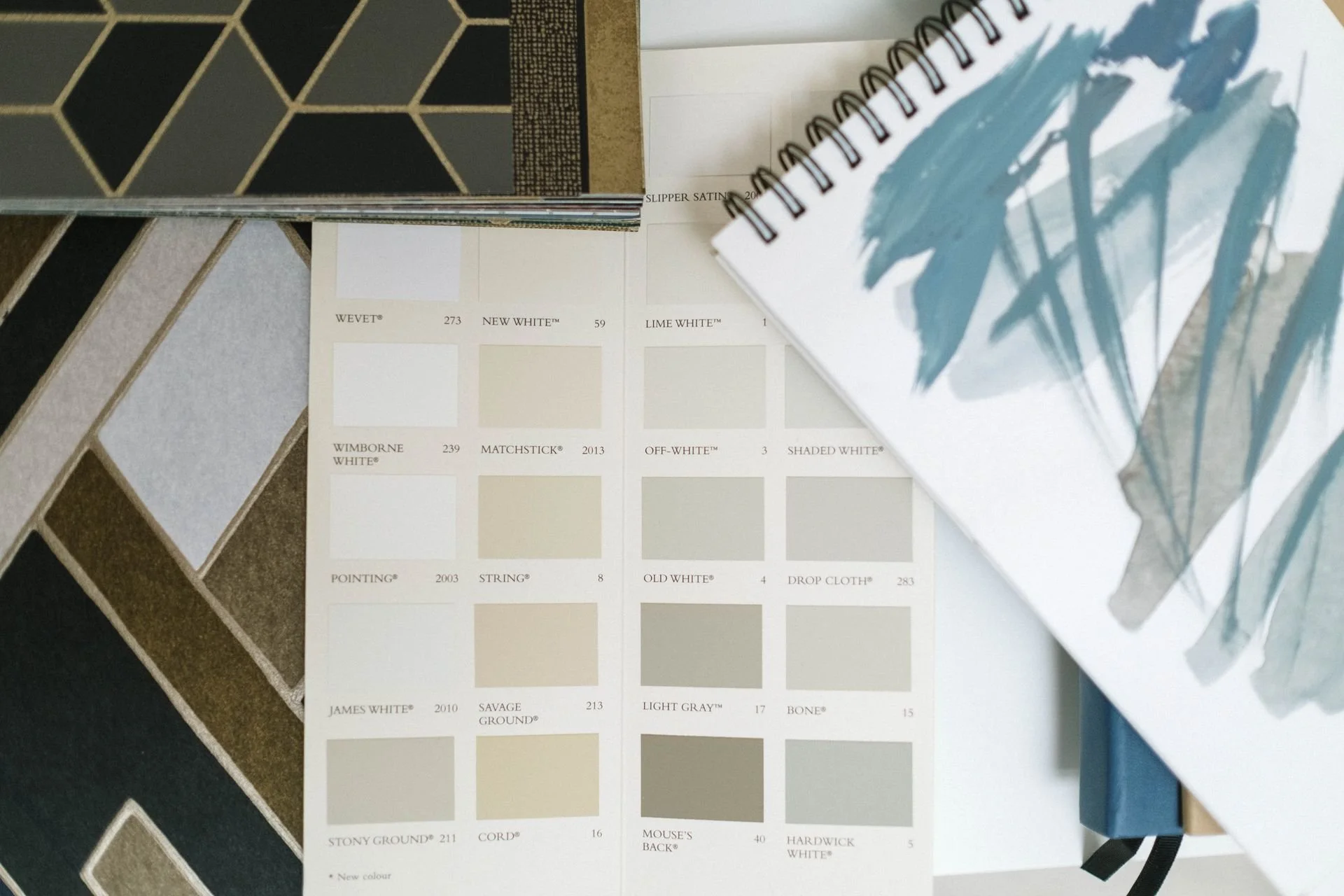
Using Colour
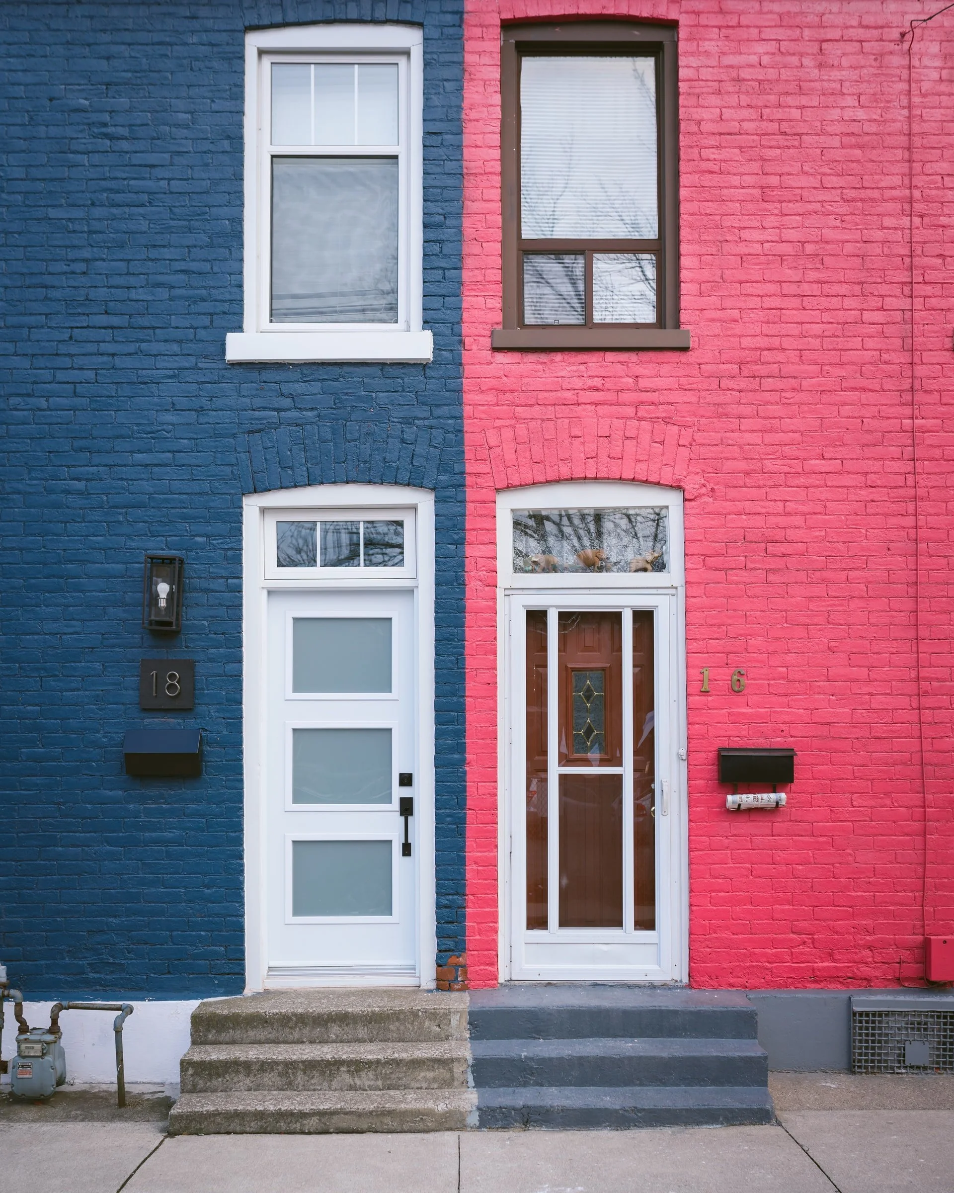
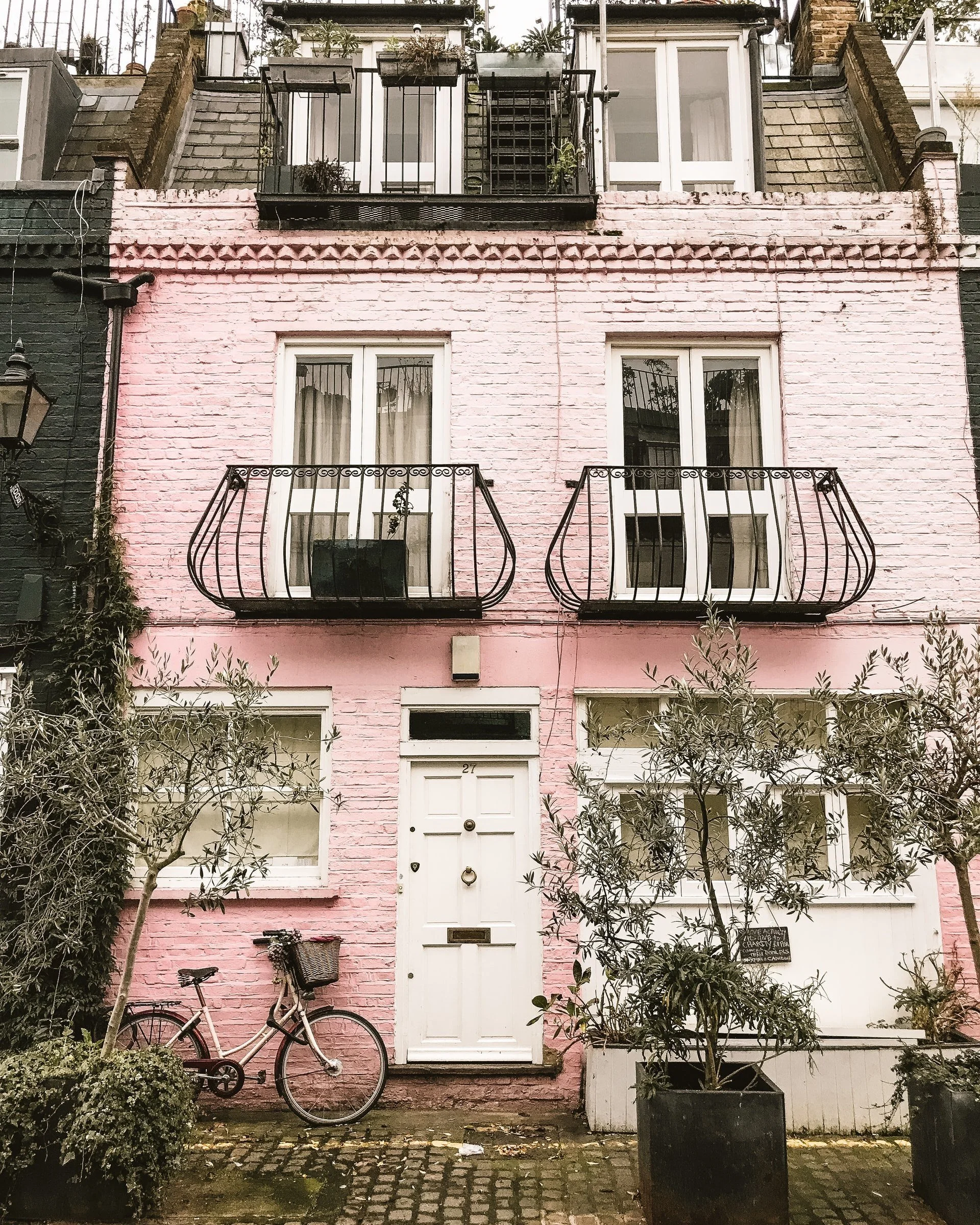
Have you ever noticed how the colour of a home’s exterior can influence your first impression? In just a glance, it can feel welcoming, striking or quietly elegant.
Whether it’s a soft sage heritage green nestled into a row of terraces or a quiet confidence of charcoal standing confidently on its own, exterior colour has a powerful way of shaping our first impression.
The right palette isn’t about following trends. It’s about creating a feeling.
Thoughtfully chosen colours can help a home blend naturally into it surroundings or stand with quiet distinction.
Even small updates such as a freshly painted front door or carefully considered trim, can transform a space.
Timeless tones. Quality finishes. Materials that age beautifully.
A home designed to feel just as considered years from now as it does today.
Colour should feel like home, not a passing trend.
Perhaps you’ve moved into a home with a palette that already feels just right. Soft neutrals. Gentle tones; A space that immediately feels easy to live in.
Or perhaps you’re ready for a change.
With new trends appearing almost daily, it’s easy to be drawn towards colours that capture a moment. While bold interiors have their place, the most enduring homes are those that reflect the people who live in them, not just the latest trend.
Colour is deeply personal.
It shifts with the morning light, softens by evening, and changes again alongside timber, stone, glass, fabrics and carefully chosen finishes.
The right palette doesn’t just look beautiful.
It creates a home that feels calm, considered and uniquely yours, today and for years to come.
A timeless backdrop doesn’t have to feel predictable.
Keeping walls soft and neutral allows personality to emerge through the pieces you choose to live with such as artwork, textiles, collected objects and meaningful details. These are the layers that make a house feel unmistakably like home.
There are no fixed rules when it comes to colour.
Just as fashion embraces unexpected combinations, interiors can too. Some of the most beautiful palettes are inspired by the natural world, where every shade sits effortlessly alongside another.
Whether you’re drawn to the coast or the countryside, nature offers endless inspiration for creating a home that feels balances, relaxed and beautifully connected to its surroundings.
Below are a few colour palettes inspired by both landscapes.
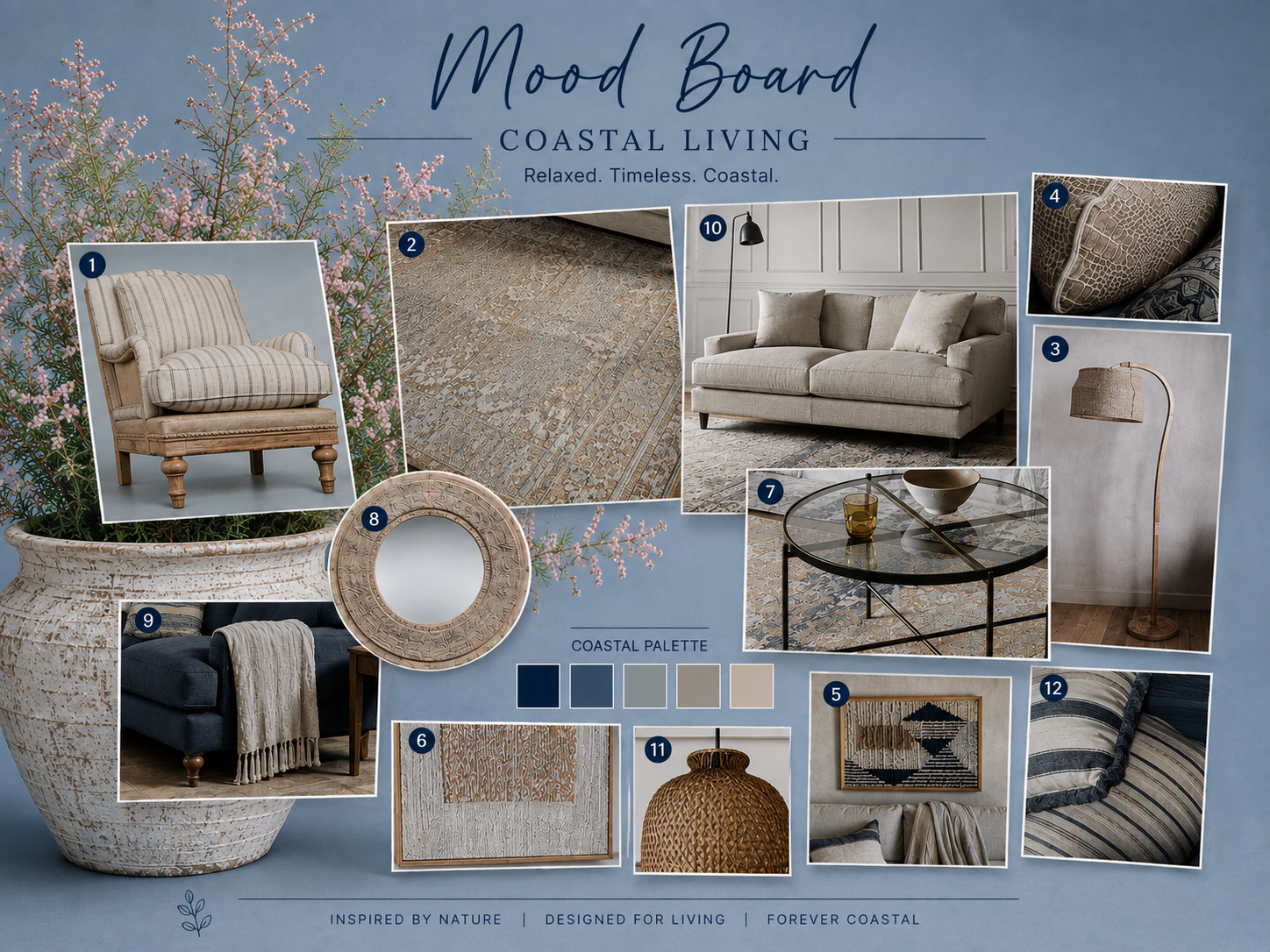
COASTAL COLOURS
A coastal palette is less about bold colour and more about capturing the calm of life by the water. gentle layers, natural light and soft contrasts create a home that feels effortless and inviting.
Soft blues & sea tones
From pale sky blue and muted aqua to rich navy, water-inspired hues bring a sense of tranquillity. They work beautifully on walls, cabinetry or through soft furnishings, adding depth without overwhelming a space.
Crisp whites & warm neutrals
White is a timeless coastal choice, especially when paired with warm sandy tones, soft beige and gently off-whites. Together, they create an atmosphere that feels light, relaxed and welcoming.
Sandy & earthy hues
Draw inspiration from the shoreline with driftwood browns, natural stone and soft sandy shades. A subtle touch of blush or coral can introduce warmth while remaining beautifully understated.
Seafoam greens & sage
Soft greens inspired by sea glass and coastal foliage offer a fresh alternative to blue. Calm, natural and versatile, they bring a quiet sense of balance to any room.
COUNTRY COLOURS
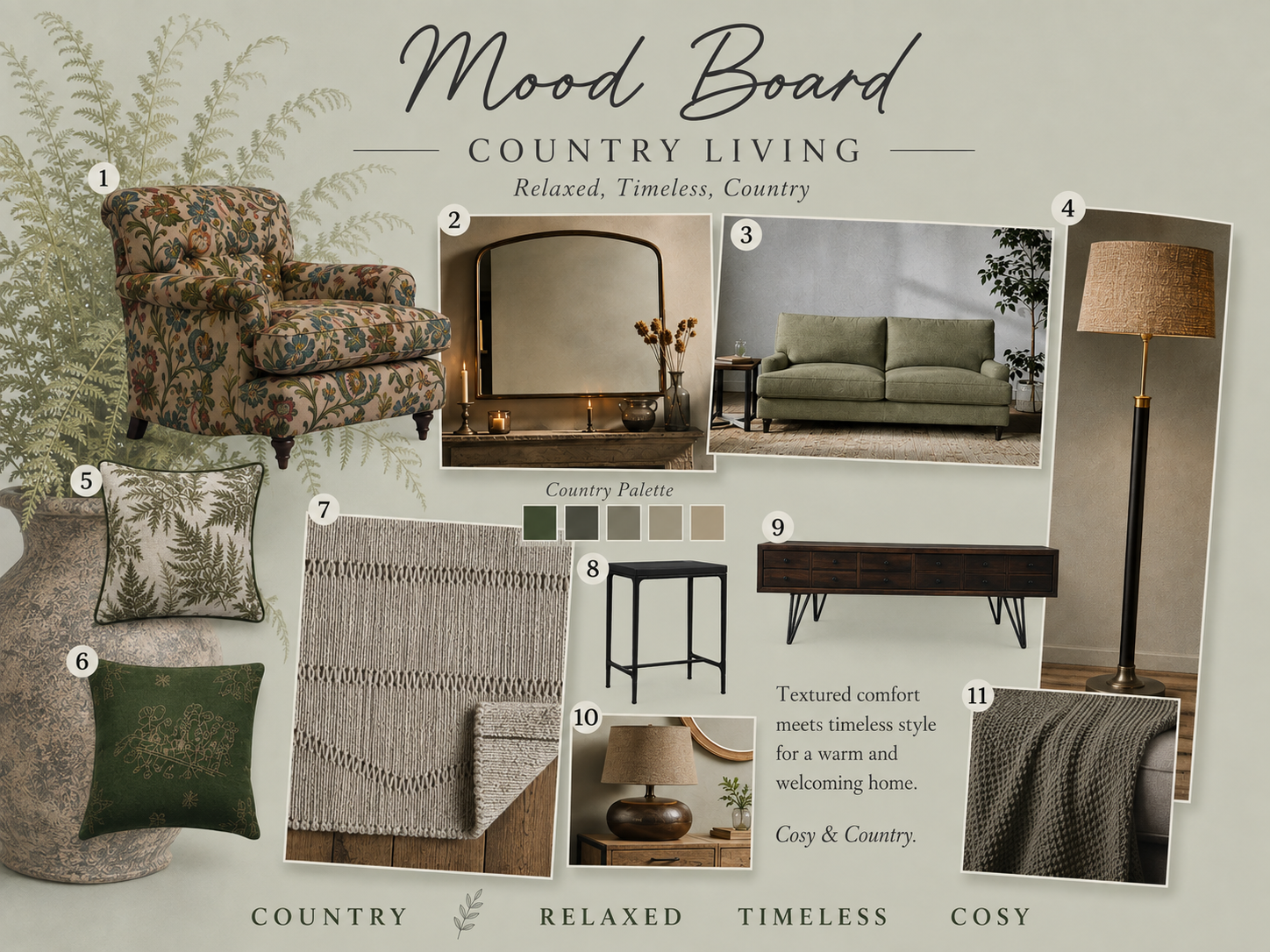
The countryside offers a timeless palette that feels calm, welcoming and effortlessly elegant.
Gentle greens
Soft sage, olive and moss greens echo the colours of fields, trees and hedgerows. these versatile shades work beautifully on walls, upholstery, cushions and curtains, bringing a sense of tranquillity and connection to nature.
Earthy tones
Warm browns, clay, terracotta, brick red and a soft stone create depth and warmth. Used through furniture, ceramics, textiles or painted finishes, these grounding colours add rustic character while remaining sophisticated and timeless.
Soft blues
Greyed blues, powder blue and duck egg blue are enduring country favourites. Their gentle, calming quality pairs especially well with natural wood, woven textures and linen, creating interiors that feel relaxed yet refined.
Bringing the palette together
For a balanced country look, choose one dominant colour, such as sage or duck egg blue, and layer in earthy tones through accessories and natural materials, this creates a home that feels considered, comfortable and inspired by the landscape beyond the window.
Fisher’s Creek - where cost meets country, one timeless colour at a time.
What Do Different Colours Mean?
Have you ever wondered why some colours make you feel calm, while others see to lift your mood or energise a space?
Choosing a colour palette for your home can feel overwhelming, particularly if you’re unsure which shades work well together. The good news is that there are no strict rules. The colours you surround yourself with can help shape the atmosphere of a room, creating spaces that feel restful, welcoming or full of character.
Below are a few simple ideas, along with some gentle colour psychology, to help inspire your choices.
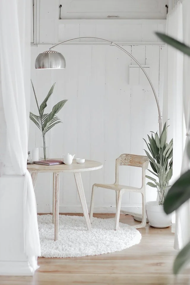
WHITE
White has long been associated with purity, simplicity and new beginnings. In many Western cultures it is linked with weddings and fresh starts, while in some other cultures it is traditionally associated with mourning.
Within the home, white creates a light, airy backdrop that allows furniture, artwork and natural textures to take centre stage, However, an all-white scheme can sometimes feel cool, particularly in north-facing rooms where natural light has a softer quality. Layering white with warm neutrals, natural wood and tactile textures creates a softer, more inviting look that feels timeless rather than stark.
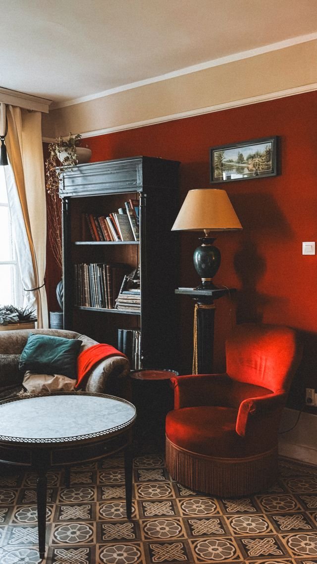
RED
Red is a colour often associated with love, passion, energy and warmth. Rich and confident, it naturally draws the eye and can create a welcoming, sociable atmosphere, which is why it has long been a popular choice for dining rooms and entertaining spaces.
As a strong colour, red is often most effective when used thoughtfully. If an entire room feels too bold, consider painting a single feature wall or introducing the colour through cushions, artwork, lampshades or decorative accessories. Softer terracotta’s and muted brick reds offer a more relaxed, country-inspired alternative while still adding warmth and character.
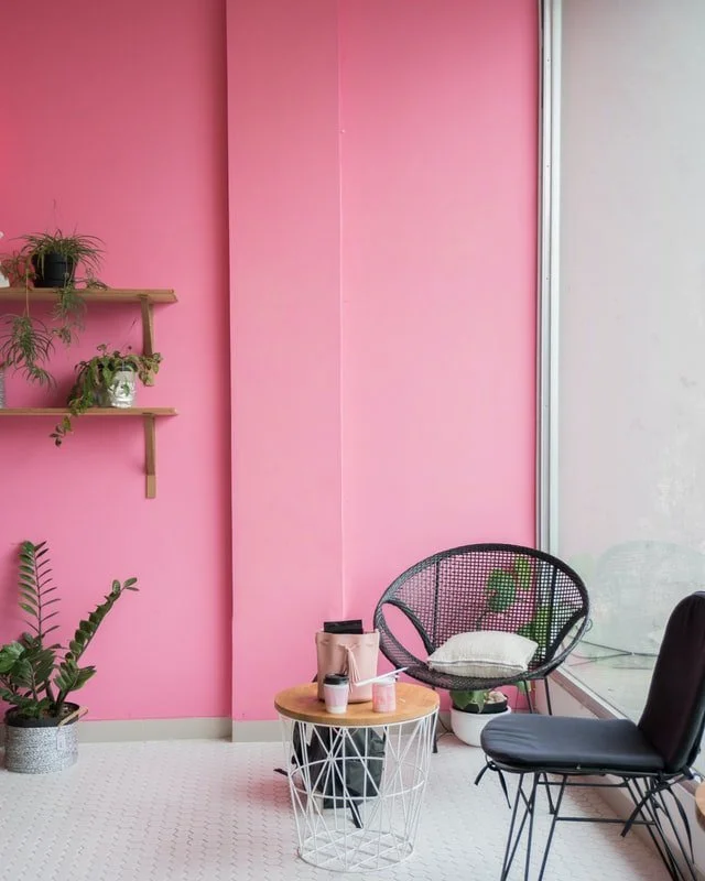
PINK
Pink is often linked with warmth, love and comfort. Depending on the shade, it can create a space that feels peaceful and restful or one that feels vibrant and full of personality.
Soft blush and dusty pinks work beautifully in bedrooms, living spaces and reading corners, bringing warmth without overwhelming a room. At the other end of the spectrum, vibrant fuchsia introduces confidence and energy. To create a more contemporary look, balance pink wit charcoal, deep olive green, rich navy or natural wood, allowing the colour to feel sophisticated rather than overly sweet.
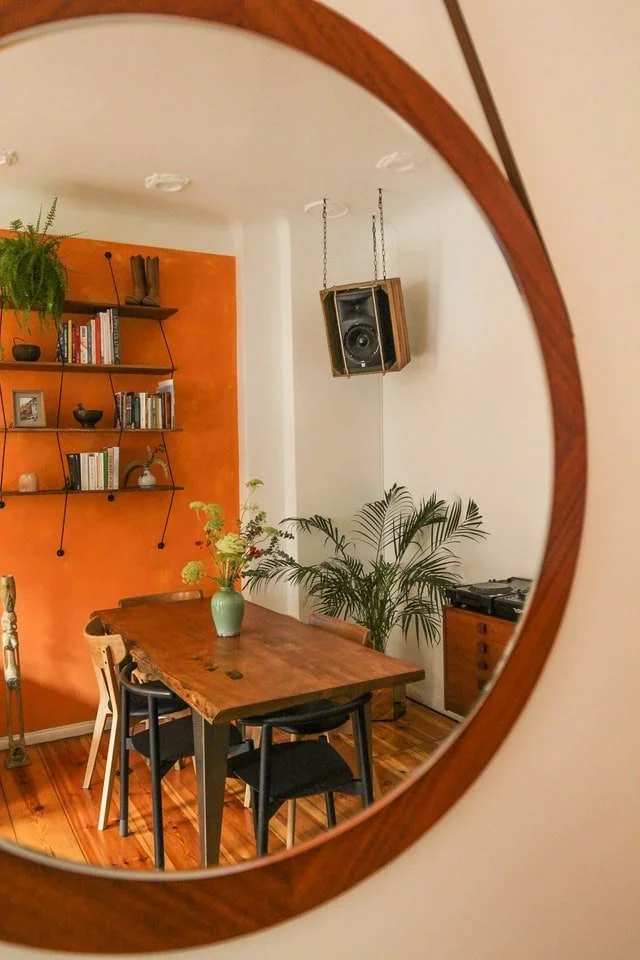
ORANGE
Orange brings a sense of warmth, optimism and comfort to a home. Welcoming and full of character, it works particularly well in living and dining rooms where it helps create a relaxed, sociable atmosphere.
As a naturally warm, advancing colour, orange can make a room feel more intimate. In smaller spaces, balance it with plenty of natural light, soft neutrals and lighter furnishings to keep the room feeling open and inviting. For a timeless country look, consider softer shades such as burnt orange, terracotta or apricot rather than brighter, more vibrant tones.
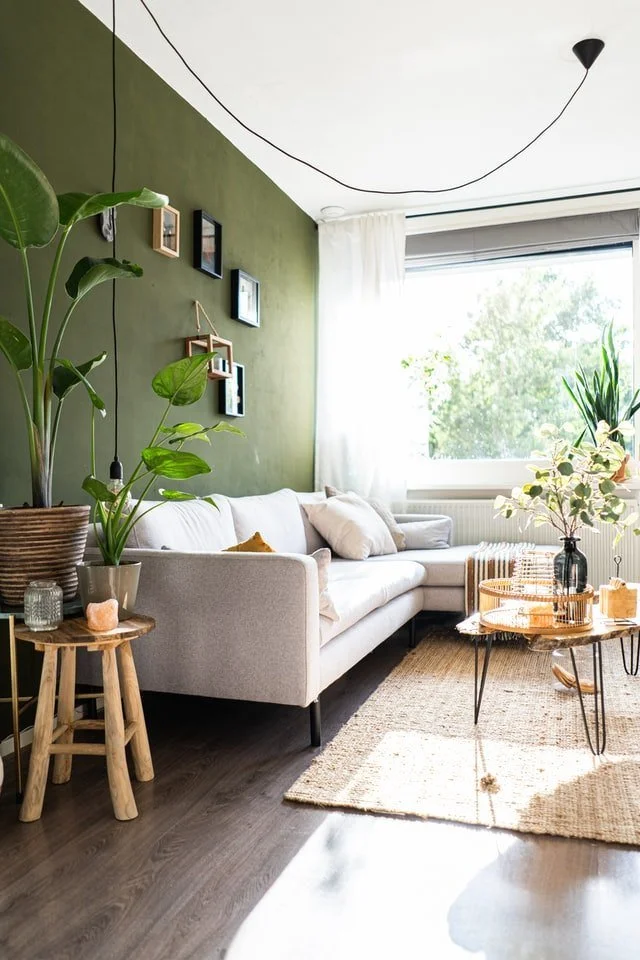
GREEN
Green is one of nature’s most enduring colours and is often associated with balance, harmony and wellbeing. Inspired by forests, hedgerows and rolling countryside, it creates spaces that feel calm, restorative and connected to the outdoors.
From soft sage and olive to rich moss and forest green, this versatile colour works beautifully in bedrooms, living rooms, kitchens and home offices. Pair green with natural wood, linen, stone and woven textures to enhance its organic appeal. If using deeper greens throughout a room, introducing accents of terracotta, mustard, rust or warm brass adds contrast, warmth and visual interest.
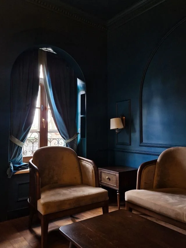
BLUE
Blue is one of the most calming and versatile colours in interior design. Often associated with serenity, trust and tranquillity, it creates spaces that feel restful and balanced, making it a natural choice for bedrooms, bathrooms and home offices.
The mood of blue depends greatly on its shade and the light within a room. Pale blues can feel fresh and airy, while deeper navy tones add depth and sophistication. In north-facing rooms, cooler blues can sometimes feel a little crisp, so balance them with warm neutrals, terracotta, mustard, natural wood or aged brass to create w welcoming and cosy atmosphere. Creams, linens and soft off-whites also add warmth while maintaining a timeless look.
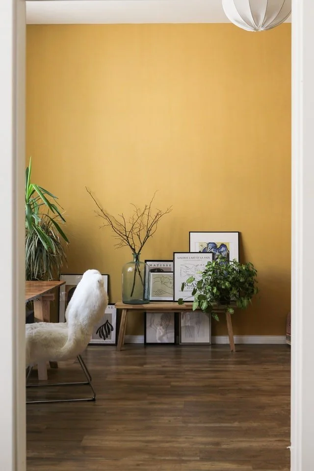
YELLOW
Yellow captures the warmth of sunshine and is often associated with optimism, happiness and creativity. Used thoughtfully, t can brighten a room and bring an uplifting sense of energy, making it particularly suited to kitchens, dining rooms and north-facing spaces where natural daylight is more limited.
The intensity of yellow makes all the difference. Soft buttery yellows, ochre and muted mustard create warmth without overwhelming a room, while brighter shades work best as accents or accessories. Although yellow can be wonderfully cheerful, any people prefer calmer tones in bedrooms, where a more restful atmosphere is often used.
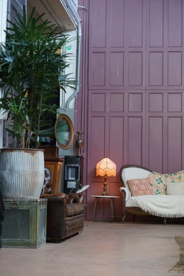
PURPLE
Purple has long been associated with luxury, creativity and individuality. From the softest lavender to rich aubergine, it offers a wide range of possibilities, each creating a different mood.
Gentle shades such as lavender, lilac and heather bring a calming, restful quality, making them well suited to bedrooms, dressing rooms or quiet reading spaces. Richer tones, including plum and aubergine, introduce depth, warmth and a sense of understated luxury. Used sparingly on a feature wall or through upholstery and accessories, they create an elegant focal point without overwhelming the room. Paring purple with soft neutrals, natural wood or brushed brass helps achieve a beautifully balanced scheme.
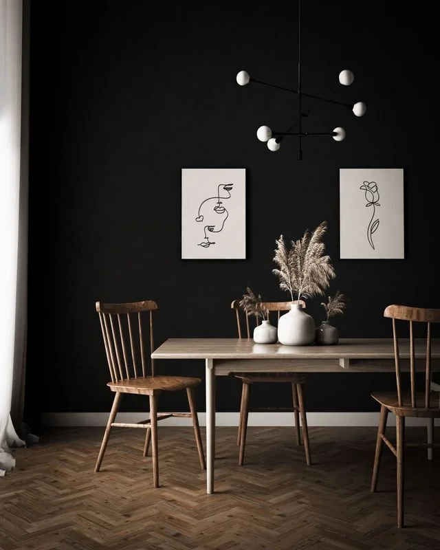
BLACK
Although technically the absence of colour, black has become one of the most versatile and sophisticated elements in contemporary interior design. Used well, it adds definition, depth and a sense of quiet confidence.
Black is excellent for anchoring a room, whether through furniture, lighting, window frames or careful chosen accessories. A matt black wall behind artwork, shelving or a fireplace can create striking contrast, allowing textures, colours and decorative pieces to stand out beautifully. As with any dark tone, balance it with natural light, warm woods and softer neutral shades to keep the space feeling welcoming rather than heavy.
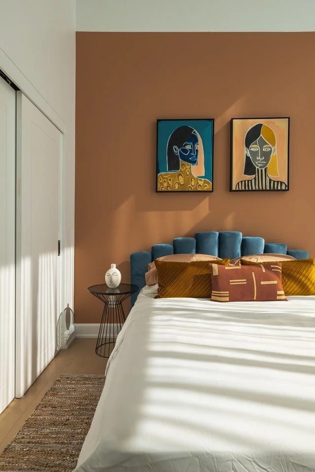
BROWN
Brown is a timeless colour associated with comfort, stability and a strong connection to nature. Inspired by wood, earth and natural fibres, it brings warmth and a reassuring sense of permanence to an interior.
From rich espresso and deep chocolate to warm tan, caramel and soft taupe, brown offers remarkable versatility. Darker shades create depth and sophistication, while lighter tones feel relaxed, welcoming and effortlessly lived-in. Brown works beautifully in living rooms, studies and dining spaces, where it help create a cosy, grounded atmosphere.
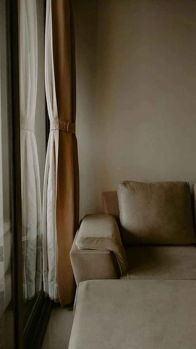
GREIGE
A blend of grey and beige, greige has become one of the most popular neutral colours in contemporary interiors.
It’s valued for its versatility and creates a calm, sophisticated backdrop. Depending on the light, it can appear warmer or cooler, making it ideal for open-plan living. Greige pairs beautifully with natural wood, black accents, soft greens and muted blues, creating a timeless scheme that suits both country and coastal homes.
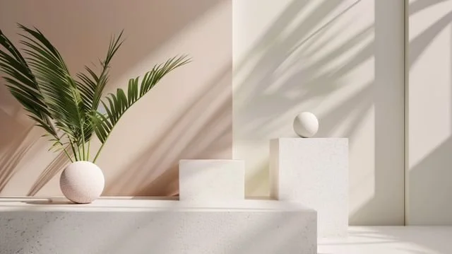
NATURAL NEUTRALS
Rather than focusing on one colour, you could include a section on Natural Neutrals as these underpin so many successful interiors.
Think oatmeal, linen, ivory, chalk, stone and warm sand. These colours create a sense of calm and allow texture to become the star of the room. Layering different neutral tones with natural materials such as wood, wool, rattan and linen produces an elegant, relaxed home that never feels dated.
There are no strict rules when choosing colour for your home.
The most successful interiors reflect both the character of the property and the people who live there. Trust your instincts, take inspiration from the natural world, and build your scheme gradually by layering colour, texture and materials that bring you joy. After all, the best homes are those that feel personal, welcoming and timeless.
DESIGNER’S TIP
Before committing to any paint colour, paint a large sample on two or three walls and look at it throughout the day. Natural light changes dramatically from morning to evening, and colour you love in daylight may feel completely different after sunset.