


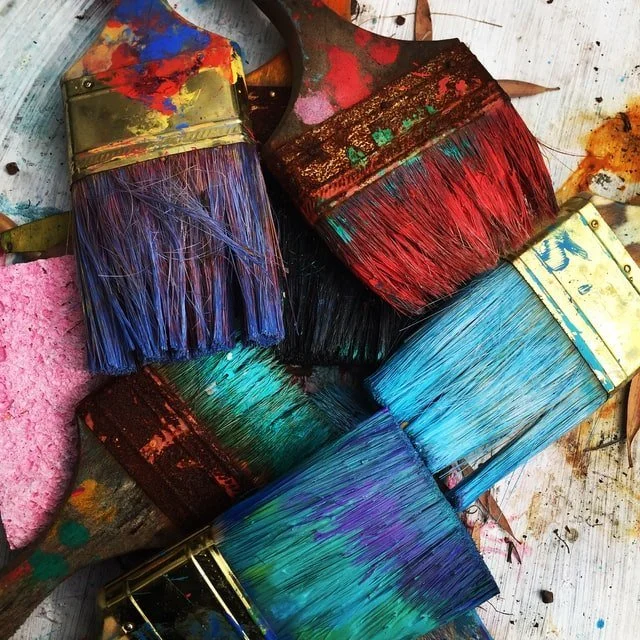
Using colour
COLOUR Have you ever walked passed a property and commented on the colour of the outside of the house? I have multiple times, sometimes they make me feel calm and have appreciated the choice of colour, whereas, other times, I have felt like the colour did not suit the property or location. With your property fresh in mind, it might be overwhelming on where to start, here I have listed a range of colours with their associations and what rooms they are best suited to help you find the most appropriate colours for your home.
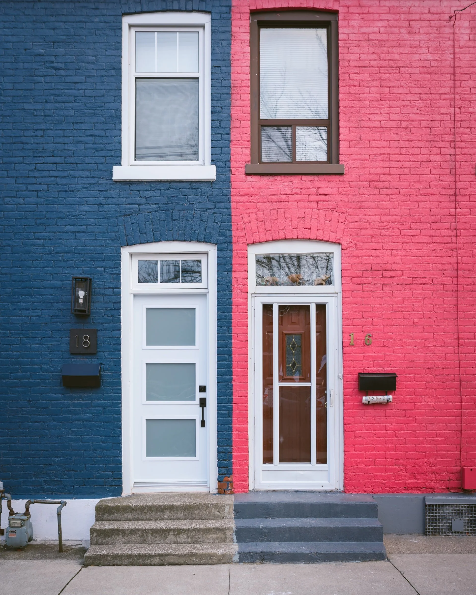
You may have bought your new home which has simple and neutral colours already painted or you may have fallen for the show home which conjured up a lifestyle image of you and your family to keep as it is. There are endless possibilities enabling you to link colour choices that you may or may not have otherwise considered, giving you confidence or even dare you to help transform your new home. Fashion trends come and go and with the rise of social media, different interior styles can also be ‘fads’.
Some rules that would have suggested ‘no’ to some colours being teamed up with each other years ago, have possibly changed today due to trends being much more flamboyant and daring, but you have to live with the colour decisions you make, and depending on whether you are after a calm environment or a daring bang on trend look for right now, is up to you. Colour acts as one of the most vital aspects of designing your property as it can change constantly due to shades of natural daylight or electrical lighting. Whilst it can create different moods, it can also differ when next to other materials, such as, highly lacquered or glossed products as well as metal, glass, wood, stone and fabric which is why when choosing these other items, it is equally important to get the look right.
If you wanted to keep the walls neutral and timeless, include other items, such as wall art, this will be more personable to your home. Although there seems to be rules of what to do and what not to do, really, there are no secrets when putting your own personality into your own personalised scheme. In the fashion industry, they are not scared to mix bold and daring colours, so why should it be different for interiors?
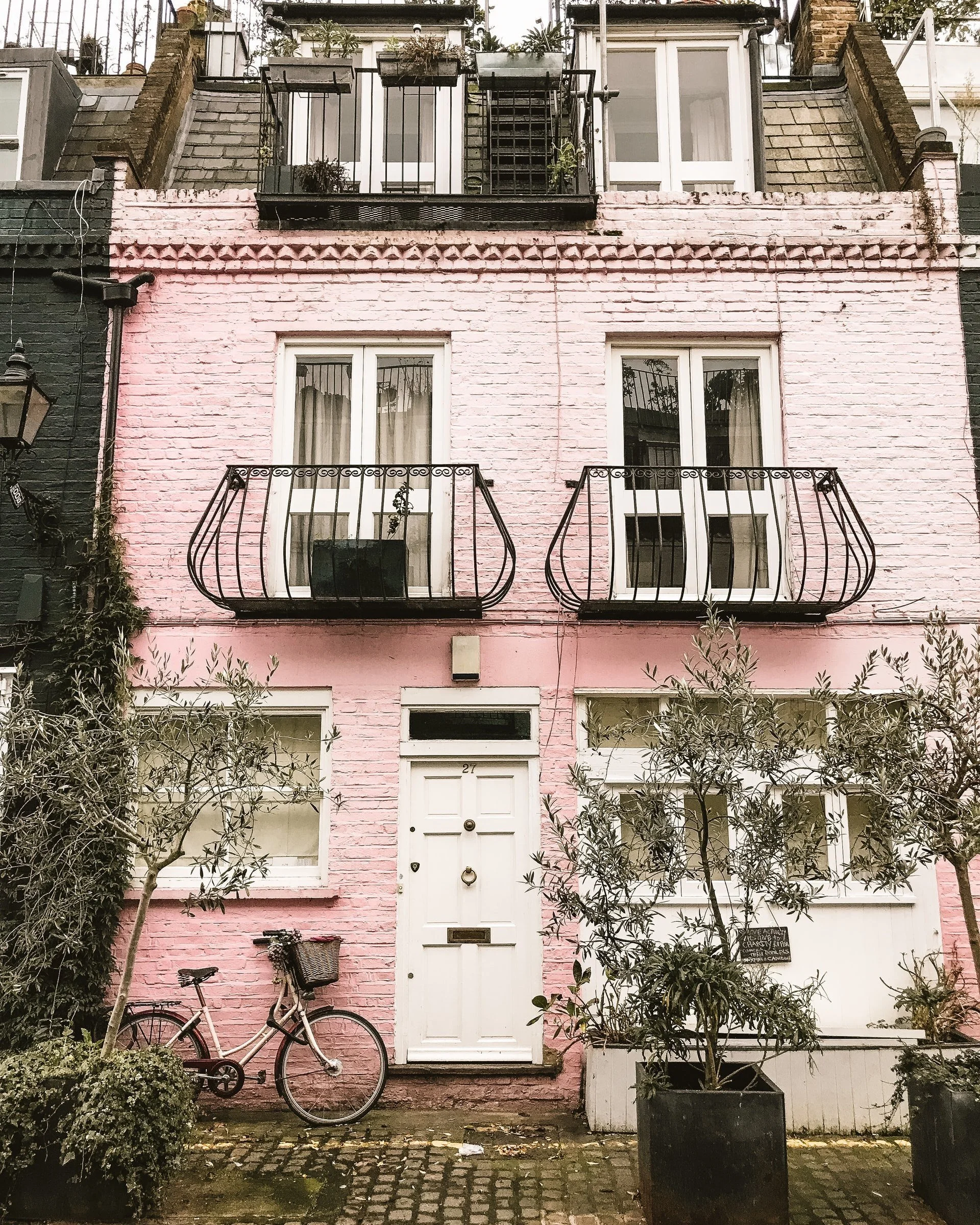
Inspiration can come from nature such as coastal or countryside and make great combinations.
Choice of Colours
The choice of colours in paint, wallpaper and fabrics today is endless and the possibilities of creating the right look for your property inside and out is vast. There are obviously fashionable colours whereby ‘on trend’ is current but, more importantly, there are colour choices which have been around for years known as heritage colours, suiting the age of the property and in keeping with the style of the property.
Paint colours from periods in British History such as Georgian (1714-1837), Victorian (1837-1901) or Edwardian & Art Deco (1901-1939) still remain very similar today or the same and we, over our life have such a passion for history and like to maintain colours to reflect the feel of the past. What are the meanings of certain colours? Planning and carrying out your own colour schemes can be taxing if you haven't got that built-in instinct of knowing what will go with what! Illustrated below are some simple ideas, along with colour psychology, to understand why your mood can be reflected based on the colours in a room.
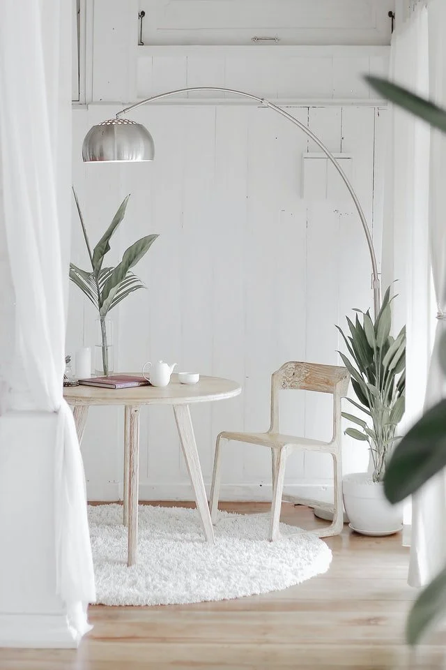
WHITE
White symbolises purity, in some cultures, goodness. Using white as your base and combining neutral colours and tones to your home can create a more natural layered look. Shades of brown and light greys can create a tranquil feel, whilst using black objects can give the room a more dramatic and sharper look. White can be used in all rooms, however, it can be cold, if not accompanied by other shades.
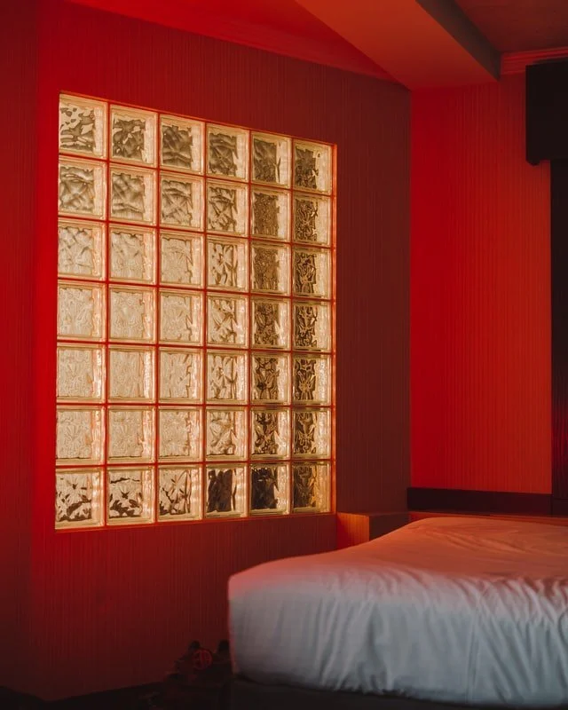
RED
Red can be associated with danger, love and passion, energy and warmth. Known mainly to be used in dining rooms as it promotes sociable and lively feelings, plus it stimulates the appetite. Red, however, can also be overpowering and lead to headaches. Either vary the shade, paint one wall red, or use it for accessories only. Suggest not to use red in a baby's room.
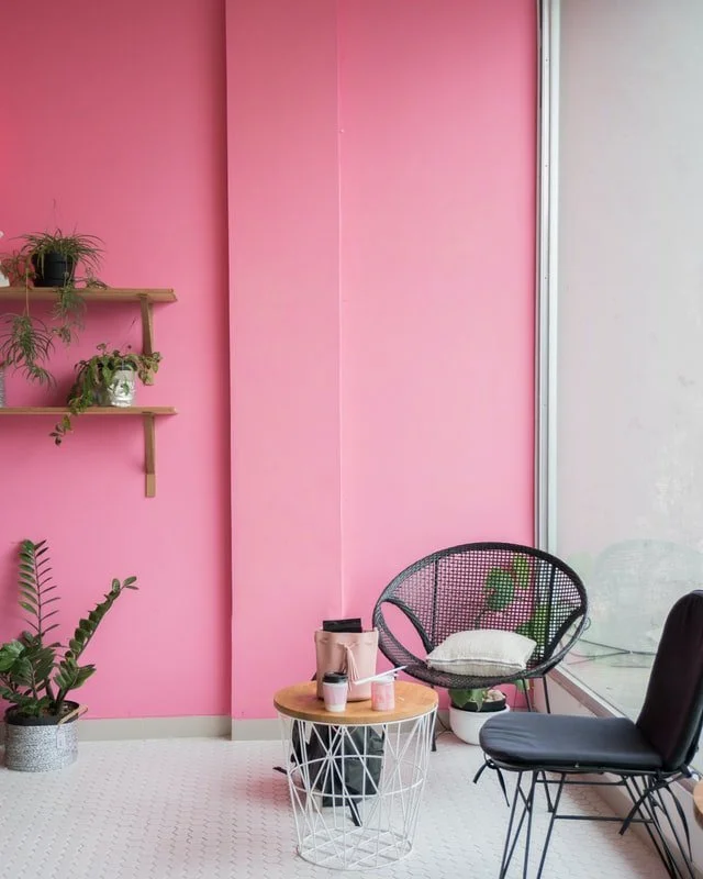
PINK
We know and associate pink to love which is best used in bedrooms as it can be peaceful and restful. A hot fuchsia can introduce passion. It can appear to be very girly and sickly sweet. To counteract this, you could either introduce hints of dark charcoal or black or a variety of wacky and bold colours.
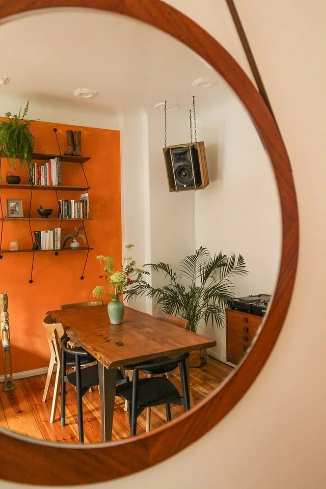
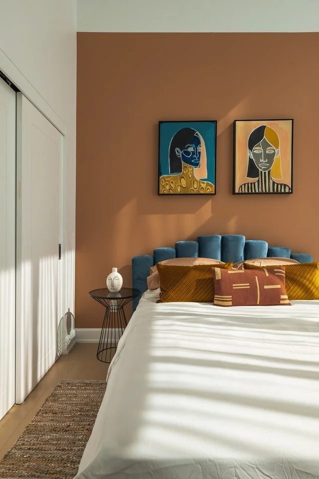
ORANGE
Orange is known for stability, reassurance, warmth, and is thought to aid digestion. Best used in a living or dining room, however, it might keep someone awake when used in a bedroom. It can make a room look smaller because it's an advancing colour, so it would be best to make sure the room gets plenty of light.
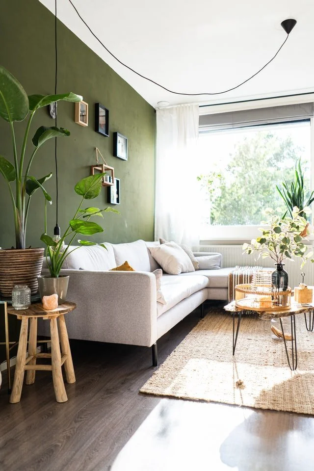
GREEN
Green is normally associated with nature, adventure and energy and is calming and restful – a balance (halfway between red and blue) indicating security and stability. Best used in bedrooms or living rooms. Too much green is thought to make people too complacent or too laid back. Perhaps inject some reds, oranges or yellows to counteract these feelings with a statement throw or cushion.
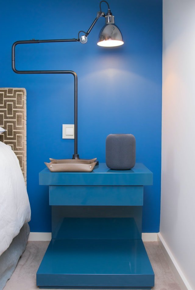
BLUE
Blue is known to be calming and soothing. It promotes intellectual thought and believed to keep hunger at bay. A sense of loyalty, serenity, authority, and protection. Blue has also known to prevent nightmares. It is best used in bedrooms, bathrooms & studies. It could however, look cold and unwelcoming. Perhaps use a blue with a warm undertone so it won’t look too chilly.
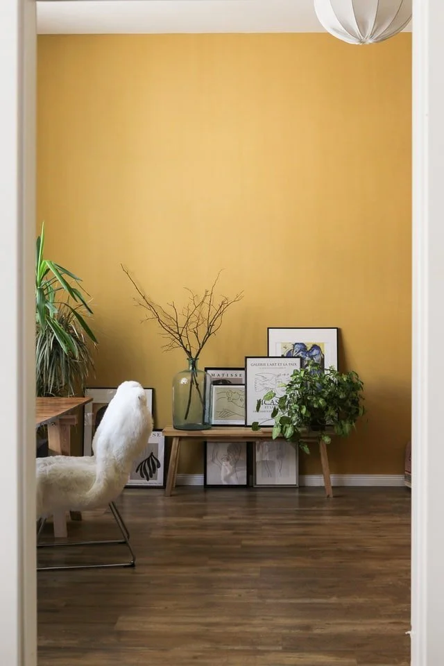
YELLOW
Yellow is associated with sunshine and energy which stimulates the intellect. A colour known to make us happy. It is a colour best used in kitchens, dining rooms or north-facing rooms. It is not very restful for a bedroom and also in some cases thought to enhance feelings of emotion and distress.
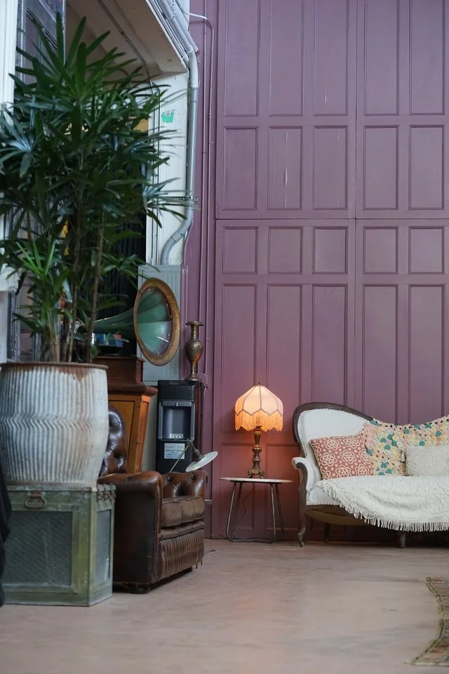
PURPLE
Purple is known for creativity, royalty, fertility, joy and magic. Best used in bedrooms but depending on the shade, it can be overpowering. Adding other subtle colours is also a great idea.
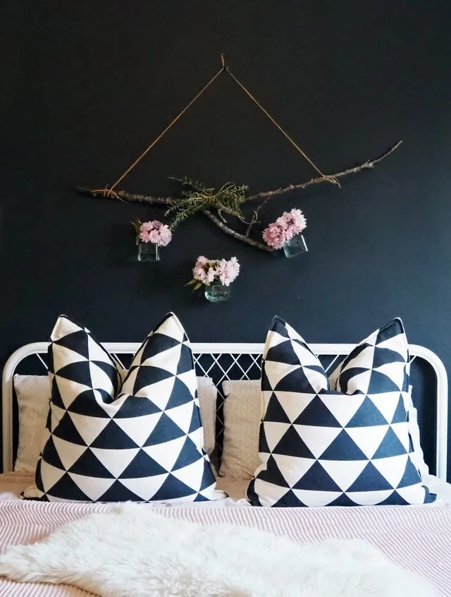
BLACK
Although black is a non-colour, it absorbs hues and reflects nothing back. It is neutral, sophisticated, powerful, dramatic and can sometimes be cold - by using warmer tones and surrounding with green plants, this will then bring more warmth to the space. Today we see so many shades available – done well as a feature wall (perhaps), can look very elaborate and stylish – suggest therefore, used in moderation and compliment with other colours.
BROWN
Brown is associated with security, stability and very practical. Best used in living rooms. As it is a more neutral colour - would suggest therefore, to introduce a livelier colour for mental stimulation such as green, blue or orange.